So, I thought I would write my first graphics tutorial (yay! -eye roll-). This is a technique I have picked up on, and it is extremely simple but looks pretty good. It is for
Photoshop. I use version 7; but I believe it can be transcribed imto other versions. I am not sure about Paint Shop Pro, sorry. Maybe somebody can test it out and see?
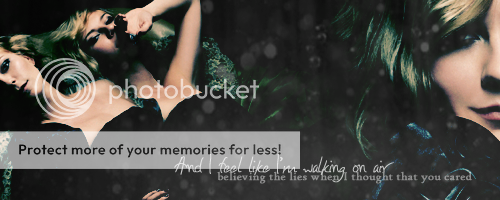
Well we are going to be making this graphic:

You are going to need:
Image 1.
Image 2. Image 3.
Texture 1.
Texture one is by . lovelondon of Red Carpet and Rebellion
1.) First I opened each of the images in their own new document to resize them. This helps keep the quality up. For image one; I went to Image -> image size. I changed the pixels to percent, and put in 40. This will make it 40% of the original size. (now 450x600). For images two and three, I made them 47% of the original or now 705x529.
2.) I placed all three images into a new image sized 500x200. This is my normal signature size, but feel free to use a different size. I put image one on the far right, and I overlapped images two and three, Placing two more up and to the right.
3.) Next comes the blending. You can use anyway you like; but I have found that Layer Masks are the easiest way to blend these particular images. If you look to the bottom of the layers palette, the second icon is a rectangle with a white circle on it. Click that once while the layer you wish to blend is selected. Use the gradient tool in black and white to blend them. The black will make the selected layer disappear, while the white makes it show. I blended three into two (three on top) and one (the topmost layer) into the other two.
4.) Once you are happy with how it looks, merge all of the layers together. The easiest way is SHIFT + CTL + E.
5.) Next I duplicated that layer by right clicking of the layer and selected “Duplicate Layer”.
6.) Now the fun part: coloring. I first went into Curves (under images -> adjustments.) I used two points. The first is input: 52; output: 30. The second is: input: 181;output: 217.
7.) Next is where you can make images really special. Under images -> adjustments there is an option called “Color Balance”: click it. Here are the numbers I put in. Under “Shadows”; -26; +32; +20. Under “Midtones” -100; -17; +44. Under “Highlights” -4; -4; -10. Then click okay.
8.) After that, it gets extremely simple. I put the layer with the new colors as “Darken” with 100% Opacity. This really brings out the reds on her skin from the original blend.
9.) Add the texture wherever you wish. Set is as “Lighten”; 80%
10.) Then I added the lyrics. They are from the song “Bruises” by Sugarcult. I placed the first line in “Honey I Stole Your Jumper”, size 18; Normal blend, 80% opacity. The second line is size 12 “High Tower Text” in Normal blend, but 50% opacity.
11.) To give it the little extra edge; although the difference is barely noticeable I copied the layer we changed the colors with. I placed it as the top layer; with Normal blend but only 8% opacity. Not too much difference, but I seem to like it better.
12.) And there you go! You are done! Like I said, it really is extremely easy. Feel free to change any of the steps as you go. But you do see how changing the coloring can change the feel of the image? Before it was fiery red; but now it looks like the perfect signature for a Narcissa Black. Remember to save in .PNG for higher quality!
I would love to see how this works out, since this is my first tutorial. I usually end up confusing people, so please feel free to ask questions/make comments/suggestions and please I would love to see what you make by using this.


